
This dashboard provides the highest-level view of your organisation’s resource health.
These high-level KPI tiles allow leadership to transition from a birds-eye view of capacity to granular performance data with a single click.
Access Level: Restricted to Primary Admin and Admin roles.
High-level KPI tiles:
-
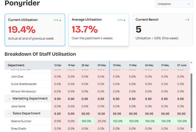
Current Utilisation: A real-time percentage of total billable effort across the entire organisation at the end of the previous week.
-
Average Utilisation: Tracks historical and projected performance over an 8-week window (the past 4 weeks combined with the next 4 weeks).
-
Current Bench: Displays the total count of staff members whose utilisation has fallen below 50% for the current week, highlighting immediate available capacity.
Note: You can drill down into any of these metrics by clicking on the respective tile.
Actual vs Forecasted Utilisation
This visual trend report allows you to bridge the gap between completed work and upcoming assignments.
-
Timeline line (Vertical Blue): Separates historical actual time from forecasted work.
-
Actual (Green): Represents the actual time logged by your team.
-
Forecast (Blue): Projects future workload based on currently assigned project hours.
-
Billable (Red): Isolates the specific portion of logged time that is chargeable to clients.
-
Target (Grey): The horizontal benchmark representing your organisation's goal for healthy utilisation.
Breakdown of Average Staff Utilisation
The central table provides a granular, week-by-week map of team performance:
-
Heat Map Logic: Cells are color-coded to highlight capacity issues.
- Green: Healthy utilisation (meeting or above target).
- Red: Under-utilisation (indicating available capacity).
- The Blue Timeline: The vertical blue line represents the current week, clearly separating historical "Actuals" (left) from "Forecasted" work (right).
- Grouping: Data is grouped by Department, allowing Admins to compare the efficiency of different functional units (e.g., Marketing vs. Engineering).
Resource Bench
This drill-down view specifically designed to identify under-utilised resources. By highlighting team members whose forecast load is below 50%, leadership can proactively reassign work to protect project margins and organisation profitability.
Every team member on the bench represents "uncaptured revenue." Use this dashboard to:
-
Reallocate Resources: Identify underutilised staff and assign them to billable projects.
-
Strategic Resourcing: Use consistent bench trends as a signal to review department health, allowing you to adjust team sizes or focus based on real-time capacity.
-
Prioritise Speed: Move beyond reactive month-end reporting. This view allows you to spot internal overspending and course-correct mid-week.
Next: Projects