
Ponyrider's dashboards connect time tracking and project data to real-time business metrics. Dashboard access is role-dependent.
Utilisation Dashboard
Access: Primary Admin and Admin only.
High-level KPI tiles:
- Current Utilisation: Real-time percentage of total billable effort at the end of the previous week.
- Average Utilisation: Historical and projected performance over an 8-week window (past 4 + next 4 weeks).
- Current Bench: Count of staff whose utilisation has fallen below 50% for the current week. Click any tile to drill down.
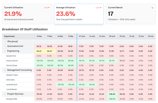
Figure: Utilisation dashboard showing actual vs. forecasted capacity grouped by department.
The Actual vs Forecasted chart shows:
- Actual (Green): Time logged by your team.
- Forecast (Blue): Projected workload based on assigned project hours.
- Billable (Red): The portion of logged time chargeable to clients.
- Target (Grey): Your organisation's utilisation goal (set in Settings > Project).
- Blue timeline: Vertical line separating historical actuals (left) from forecasted work (right).
The staff utilisation table is colour-coded: Green = healthy (at or above target); Red = under-utilisation. Data is grouped by Department.
Projects Dashboard
Access: Primary Admin and Admin only.
KPI tiles:
- Total Projects: Count of all active projects. Click to see client, project, start/end dates, and timesheets to approve.
- Forecast Margin: Cumulative expected profitability. Click to see per-project revenue (forecast vs invoiced), cost (forecast vs actual), and margin comparisons.
- Revenue Forecast: Total projected income. Click to see uninvoiced projects and per-project revenue vs forecast.
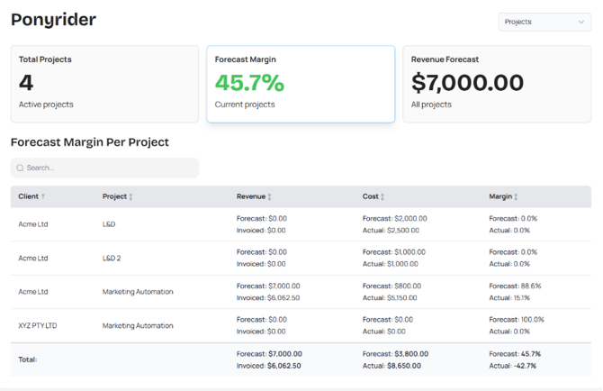
Figure: Finance dashboard showing client account profitability with revenue and margin data.
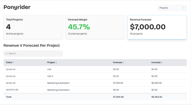
Figure: Revenue Forecast breakdown showing uninvoiced projects and per-project revenue vs. forecast.
Finance Dashboard
Access: Primary Admin, Admin, and Finance Manager.
Provides a rolling 6-month perspective on financial health.
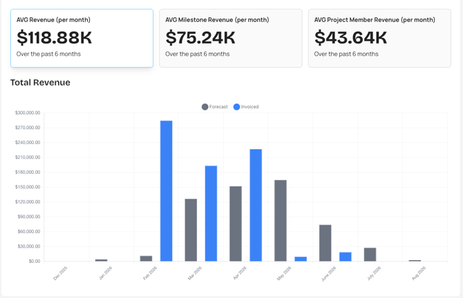
Figure: Finance dashboard charts showing milestone revenue and average project member revenue metrics.
- AVG Revenue (per month): Mean total revenue generated each month.
- AVG Milestone Revenue (per month): Revenue from project milestones.
- AVG Project Member Revenue (per month): Revenue per resource per project.
Project Manager Dashboard
Access: Primary Admin, Admin, and Project Manager.
Scoped to projects assigned to the project manager — total projects, forecast margin, and cumulated expected revenue.
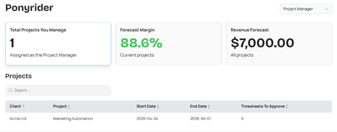
Figure: Project Manager dashboard showing forecasted margin, KPI tiles, and expected revenue by project.
Tip: Monitor the Timesheets to Approve column daily to keep financial forecasts and invoices accurate.
My Dashboard (Personal)
Access: All users.
- Current Utilisation: Your actual billable performance as a percentage of total capacity at the end of the previous week.
- Total Projects Assigned: Count of all active projects where you are a team member.
- Missing Timesheet Hours: Total hours not yet submitted across the past five periods.
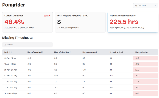
Figure: My Dashboard showing the current user's task workload and administrative action indicators.
The Missing Timesheet Hours view highlights gaps in previous periods with hours missing highlighted in red. Use this at month-end to "clear the red" before final financial reports are generated.
Resource and Revenue Forecasting
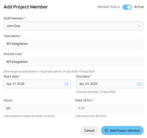
Figure: Resource forecasting form showing project window, input hours, and forecast end date validation.
| Metric | Calculation logic |
|---|---|
| Actual Utilisation | Actual hours logged by the user on their timesheet for that day. |
| Forecast Utilisation | Predicted hours based on total project hours assigned across active projects. |
| Target Utilisation | The productivity benchmark — default 80%, customisable in Settings > Project. |
Utilisation percentages compare the user's logged time per day vs their expected hours per day. Public holidays are excluded so utilisation is not penalised for non-working days.
If assigned hours don't fit the date window (e.g., 40 hours over a 3-day window), Ponyrider prompts you to review the forecast end date. Revenue is calculated as assigned hours × role-based rate from the Rate Card.
Report Subscriptions
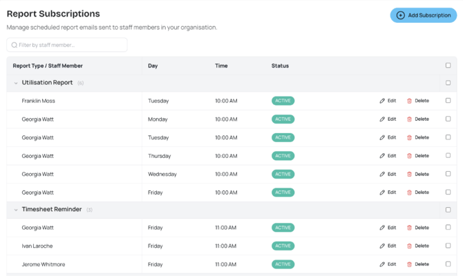
Figure: Report Subscriptions page showing registered subscriptions for utilisation and timesheet reminder reports.
Two report types are available:
- Utilisation Report: Sent on a schedule to help managers track team utilisation.
- Timesheet Reminder: Sent to remind staff to submit their timesheets.
To set up: navigate to Subscriptions, click Add Subscription, select the report type, frequency, and delivery day/time, then click Save. Ponyrider warns you if the same report is already scheduled for the same day and time. Use the bulk checkbox to delete multiple subscriptions at once.
Next: My Dashboard